Images & figures
Image styles and figure component for displaying images and text.
Image shapes
import Image from 'next/image'
import Row from 'react-bootstrap/Row'
import Col from 'react-bootstrap/Col'
export default function ImageShapesDemo() {
return (
<Row xs={1} sm={3} className="gy-4 gx-3 gx-md-4">
<Col>
<Image
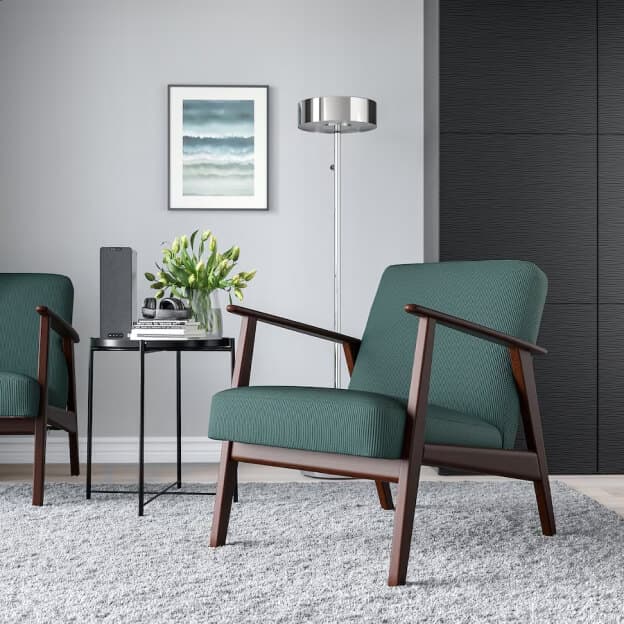
src="/img/shop/furniture/product/06.jpg"
width={290}
height={290}
alt="Square image"
className="bg-body-tertiary"
/>
</Col>
<Col>
<Image
src="/img/blog/list/02.jpg"
width={290}
height={290}
alt="Rounded image"
className="bg-body-tertiary rounded-4"
/>
</Col>
<Col>
<Image
src="/img/blog/list/03.jpg"
width={290}
height={290}
alt="Circle image"
className="bg-body-tertiary rounded-circle"
/>
</Col>
</Row>
)
}Thumbnails
import Image from 'next/image'
import Row from 'react-bootstrap/Row'
import Col from 'react-bootstrap/Col'

export default function ImageThumbnailsDemo() {
  return (
    <Row xs={1} sm={3} className="gy-4 gx-3 gx-md-4">
      <Col>
        <Image
          src="/img/shop/furniture/product/06.jpg"
          width={290}
          height={290}
          alt="Square thumbnail"
          className="img-thumbnail rounded-0"
        />
      </Col>
      <Col>
        <Image
          src="/img/blog/list/02.jpg"
          width={290}
          height={290}
          alt="Rounded thumbnail"
          className="img-thumbnail"
        />
      </Col>
      <Col>
        <Image
          src="/img/blog/list/03.jpg"
          width={290}
          height={290}
          alt="Circle thumbnail"
          className="img-thumbnail rounded-circle"
        />
      </Col>
    </Row>
  )
}
Figures with caption
import ImageWithCaption from '@/components/image/image-with-caption'
import Row from 'react-bootstrap/Row'
import Col from 'react-bootstrap/Col'

export default function FiguresWithCaptionsDemo() {
  return (
    <Row xs={1} sm={3} className="gy-4 gx-3 gx-md-4">
      <Col>
        <ImageWithCaption
          src="/img/shop/furniture/product/06.jpg"
          width={290}
          height={290}
          caption="Caption on the left"
        />
      </Col>
      <Col>
        <ImageWithCaption
          src="/img/blog/list/02.jpg"
          width={290}
          height={290}
          caption="Caption in the center"
          className="text-center"
        />
      </Col>
      <Col>
        <ImageWithCaption
          src="/img/blog/list/03.jpg"
          width={290}
          height={290}
          caption="Caption on the right"
          className="text-end"
        />
      </Col>
    </Row>
  )
}
Image swap on hover

import ImageSwapOnHover from '@/components/image/image-swap-on-hover'

export default function ImageSwapOnHoverDemo() {
  return (
    <ImageSwapOnHover
      imageSwapFrom={{
        src: '/img/shop/furniture/04.png',
        width: 306,
        height: 306,
        alt: 'Image idle',
      }}
      imageSwapTo={{
        src: '/img/shop/furniture/04-hover.jpg',
        width: 306,
        height: 306,
        alt: 'Image hover',
      }}
      className="rounded"
      style={{ maxWidth: 306 }}
    />
  )
}
Image scale (zoom) on hover
import Image from 'next/image'

export default function ImageScaleOnHoverDemo() {
  return (
    <div className="hover-effect-scale bg-body-tertiary rounded overflow-hidden" style={{ maxWidth: 306 }}>
      <Image
        src="/img/shop/furniture/product/06.jpg"
        width={306}
        height={306}
        alt="Image"
        className="hover-effect-target"
      />
    </div>
  )
}