
- Display:OLED 1440x1600
- Graphics:Adreno 540
- Sound:2x3.5mm jack
- Input:4 built-in cameras
Product cards
Display essential information about individual products, such as images, names, prices, and brief descriptions.
Electronics product card
'use client'

import ProductCardElectronics from '@/components/shop/product-card-electronics'

export default function ElectronicsProductCardDemo() {
  return (
    <ProductCardElectronics
      image={{
        src: '/img/shop/electronics/01.png',
        width: 378,
        height: 352,
        alt: 'VR Glasses' // If this field is left empty, the default title string will be used.
      }}
      title="VRB01 Virtual Reality Glasses"
      href="#"
      price={{
        current: 340.99,
        original: 430,
        // prefix: '€', // Optionally override prefix, "$" is used by default
        // suffix: 'including tax', // Optional suffix text
      }}
      reviews={{
        rating: 3.5,
        count: 123,
      }}
      badge={{
        label: '-21%',
        bg: 'danger', // 'primary' | 'secondary' | 'success' | 'warning' | 'body-tertiary' | 'body-secondary' | 'info' | 'light' | 'dark' | 'white' | 'black' | 'primary-subtle' | 'success-subtle' | 'danger-subtle' | 'warning-subtle' | 'info-subtle'
        // color: 'dark' // 'light' | 'primary' | 'secondary' | 'success' | 'warning' | 'body-tertiary' | 'body-secondary' | 'info' | 'light' | 'dark' | 'white' | 'black'
      }}
      // stock={{
      //   current: 25, // Current number of items in stock
      //   initial: 60, // Initial number of items in stock
      //   label: 'Available', // Optionally override label
      //   ariaLabel: 'Available in stock',  // Optionally override the progress bar's aria-label
      // }}
      specs={{
        Display: 'OLED 1440x1600',
        Graphics: 'Adreno 540',
        Sound: '2x3.5mm jack',
        Input: '4 built-in cameras',
      }}
      // cartButton={false} // Disable Add to Cart button
      // wishlistButton={false} // Disable Add to Wishlist button
      // compareButton={false} // Disable Compare button
      cartButton={{
        // label: 'Add to Cart', // Optionally override the button's aria-label for desktop and its label for mobile devices.
        onClick: () => console.log('"Add to Cart" button has been clicked!'),
      }}
      wishlistButton={{
        // active: true, // The wishlist button appears in an active state, indicating that the item has been added to the wishlist.
        // labelAdd: 'Add to Wishlist', // Optionally override the button's aria-label in "add" state for desktop and its label for mobile devices.
        // labelRemove: 'Remove from Wishlist', // Optionally override the button's aria-label in "remove" state for desktop and its label for mobile devices.
        onClick: () => console.log('"Add to Wishlist" button has been clicked!'),
      }}
      compareButton={{
        // active: true, // The compare button appears in an active state, indicating that the item has been added to the comparison list.
        // labelAdd: 'Compare', // Optionally override the button's aria-label in "add" state for desktop and its label for mobile devices.
        // labelRemove: 'Remove from Comparison', // Optionally override the button's aria-label in "remove" state for desktop and its label for mobile devices.
        onClick: () => console.log('"Compare" button has been clicked!'),
      }}
      className="mb-4"
      style={{ maxWidth: 306 }}
    />
  )
}
Electronics product list
-40%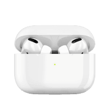
import ProductListElectronics from '@/components/shop/product-list-electronics'

export default function ElectronicsProductListDemo() {
  return (
    <ProductListElectronics
      image={{
        src: '/img/shop/electronics/thumbs/04.png',
        alt: 'AirPods 2 Pro' // If this field is left empty, the default title string will be used.
      }}
      title="Headphones Apple AirPods 2 Pro"
      href="#"
      price={{
        current: 209.99,
        original: 356,
        // prefix: '€', // Optionally override prefix, "$" is used by default
        // suffix: 'including tax', // Optional suffix text
      }}
      reviews={{
        rating: 5,
        count: 340,
      }}
      badge={{
        label: '-40%',
        bg: 'danger', // 'primary' | 'secondary' | 'success' | 'warning' | 'body-tertiary' | 'body-secondary' | 'info' | 'light' | 'dark' | 'white' | 'black' | 'primary-subtle' | 'success-subtle' | 'danger-subtle' | 'warning-subtle' | 'info-subtle'
        // color: 'dark' // 'light' | 'primary' | 'secondary' | 'success' | 'warning' | 'body-tertiary' | 'body-secondary' | 'info' | 'light' | 'dark' | 'white' | 'black'
      }}
      style={{ maxWidth: 400 }}
    />
  )
}
Fashion product card
Sale
SMLXL
$27.00 $35.00
+3 colors
'use client'

import ProductCardFashion from '@/components/shop/product-card-fashion'

export default function FashionProductCardDemo() {
  return (
    <ProductCardFashion
      image={{
        src: '/img/shop/fashion/06.png',
        width: 420,
        height: 472,
        // bg: 'none', // 'body' | 'body-tertiary' (default) | 'body-secondary' | 'primary' | 'secondary' | 'success' | 'danger' | 'warning' | 'info' | 'light' | 'dark' | 'white' | 'black' | 'primary-subtle' | 'success-subtle' | 'danger-subtle' | 'warning-subtle' | 'info-subtle'
        alt: 'Men shirt' // If this field is left empty, the default title string will be used.
        // style: { backgroundColor: '#e0e5eb' }, // Sets inline styles, like backgroundColor for more customization
      }}
      title="Classic cotton men's shirt"
      href="#"
      price={{
        current: 27,
        original: 35,
        // prefix: '€', // Optionally override prefix, "$" is used by default
        // suffix: 'including tax', // Optional suffix text
      }}
      sizes={['S', 'M', 'L', 'XL', '2XL', '3XL']}
      colors={{
        toggles: [
          { value: 'Blue', hex: '#c1cde7' },
          { value: 'Dark blue', hex: '#526f99' },
          { value: 'White', hex: '#e0e5eb' },
          { value: 'Black', hex: '#364254' },
        ],
        // label: 'colors' // Optionally override the label
        onChange: (color) => console.log(`${color} color is selected.`),
      }}
      badge={{
        label: 'Sale',
        bg: 'danger', // 'primary' | 'secondary' | 'success' | 'warning' | 'body-tertiary' | 'body-secondary' | 'info' | 'light' | 'dark' | 'white' | 'black' | 'primary-subtle' | 'success-subtle' | 'danger-subtle' | 'warning-subtle' | 'info-subtle'
        // color: 'dark' // 'light' | 'primary' | 'secondary' | 'success' | 'warning' | 'body-tertiary' | 'body-secondary' | 'info' | 'light' | 'dark' | 'white' | 'black'
      }}
      // wishlistButton={false} // Disable Add to Wishlist button
      wishlistButton={{
        // active: true, // The wishlist button appears in an active state, indicating that the item has been added to the wishlist.
        // labelAdd: 'Add to Wishlist', // Optionally override the button's aria-label in "add" state.
        // labelRemove: 'Remove from Wishlist', // Optionally override the button's aria-label in "remove" state.
        onClick: () => console.log('"Add to Wishlist" button has been clicked!'),
      }}
      style={{ maxWidth: 306 }}
    />
  )
}
Furniture product card
-14%

Soft chair with cushion and wooden legs
$245.00 $280.00
'use client'

import ProductCardFurniture from '@/components/shop/product-card-furniture'

export default function FurnitureProductCardDemo() {
  return (
    <ProductCardFurniture
      image={{
        src: ['/img/shop/furniture/01.png', '/img/shop/furniture/01-hover.jpg'],
        width: 460,
        height: 460,
        alt: 'Soft chair' // If this field is left empty, the default title string will be used.
      }}
      title="Soft chair with cushion and wooden legs"
      href="#"
      price={{
        current: 245,
        original: 280,
        // prefix: '€', // Optionally override prefix, "$" is used by default
        // suffix: 'including tax', // Optional suffix text
      }}
      colors={{
        toggles: [
          { value: 'Emerald', hex: '#32808e' },
          { value: 'Bluish gray', hex: '#767e93' },
          { value: 'Mustard', hex: '#cd8d01' },
        ],
        onChange: (color) => console.log(`${color} color is selected.`),
      }}
      badge={{
        label: '-14%',
        bg: 'danger', // 'primary' | 'secondary' | 'success' | 'warning' | 'body-tertiary' | 'body-secondary' | 'info' | 'light' | 'dark' | 'white' | 'black' | 'primary-subtle' | 'success-subtle' | 'danger-subtle' | 'warning-subtle' | 'info-subtle'
        // color: 'dark' // 'light' | 'primary' | 'secondary' | 'success' | 'warning' | 'body-tertiary' | 'body-secondary' | 'info' | 'light' | 'dark' | 'white' | 'black'
      }}
      // cartButton={false} // Disable Add to cart button
      // notifyButton={false} // Disable Notify button
      // wishlistButton={false} // Disable Add to wishlist button
      cartButton={{
        // label: 'Add to cart', // Optionally override button aria-label on desktop and label on mobile
        onClick: () => console.log('"Add to Cart" button has been clicked!'),
      }}
      notifyButton={{
        // label: 'Notify of availability', // Optionally override button aria-label on desktop and label on mobile
        onClick: () => console.log('"Notify" button has been clicked!'),
      }}
      wishlistButton={{
        // active: true, // The wishlist button appears in an active state, indicating that the item has been added to the wishlist.
        // labelAdd: 'Add to Wishlist', // Optionally override the button's aria-label in "add" state.
        // labelRemove: 'Remove from Wishlist', // Optionally override the button's aria-label in "remove" state.
        onClick: () => console.log('"Add to Wishlist" button has been clicked!'),
      }}
      // active={true} // If true, the component initially displays "imageSwapTo" and switches to "imageSwapFrom" on hover.
      // outOfStock={true} // If true, the component is muted and "Notify" button is shown instead of "Add to Cart" button if not disabled.
      style={{ maxWidth: 306 }}
    />
  )
}
Grocery product card

'use client'

import { useState } from 'react'
import ProductCardGrocery from '@/components/shop/product-card-grocery'

export default function GroceryProductCardDemo() {
  const [count, setCount] = useState(0)

  return (
    <ProductCardGrocery
      image={{
        src: '/img/shop/grocery/02.png',
        width: 282,
        height: 236,
        alt: 'Fresh orange' // If this field is left empty, the default title string will be used.
      }}
      title="Fresh orange Klementina, Spain"
      href="#"
      price={{
        current: 3.12,
        original: 4.05,
        // prefix: '€', // Optionally override prefix, "$" is used by default
        // suffix: 'including tax', // Optional suffix text
      }}
      description="1kg"
      badge={{
        label: '-30%',
        bg: 'danger', // 'primary' | 'secondary' | 'success' | 'warning' | 'body-tertiary' | 'body-secondary' | 'info' | 'light' | 'dark' | 'white' | 'black' | 'primary-subtle' | 'success-subtle' | 'danger-subtle' | 'warning-subtle' | 'info-subtle'
        // color: 'dark' // 'light' | 'primary' | 'secondary' | 'success' | 'warning' | 'body-tertiary' | 'body-secondary' | 'info' | 'light' | 'dark' | 'white' | 'black'
      }}
      // cartButton={false} // Disable Add to cart button
      // wishlistButton={false} // Disable Add to wishlist button
      cartButton={{
        // defaultValue: 1, // Sets the initial quantity when using an uncontrolled component
        value: count,
        // incrementBtnLabel: "Increment quantity", // Optionally change increment button aria-label
        // decrementBtnLabel: "Decrement quantity", // Optionally change decrement button aria-label
        onChange: (value) => {
          console.log('Changed to:', value)
          setCount(value)
        },
        onIncrement: (value) => {
          console.log('Incremented to:', value)
          setCount(value)
        },
        onDecrement: (value) => {
          console.log('Decremented to:', value)
          setCount(value)
        },
      }}
      wishlistButton={{
        // active: true, // The wishlist button appears in an active state, indicating that the item has been added to the wishlist.
        // labelAdd: 'Add to Wishlist', // Optionally override the button's aria-label in "add" state.
        // labelRemove: 'Remove from Wishlist', // Optionally override the button's aria-label in "remove" state.
        onClick: () => console.log('"Add to Wishlist" button has been clicked!'),
      }}
      style={{ maxWidth: 224 }}
    />
  )
}
Marketplace product card
Sale
Multi device mockup PSD
$27 $34
43 sales
'use client'

import ProductCardMarketplace from '@/components/shop/product-card-marketplace'

export default function MarketplaceProductCardDemo() {
  return (
    <ProductCardMarketplace
      // large // Optional prop to increase the font size of the title and price.
      image={{
        src: '/img/shop/marketplace/13.jpg',
        width: 472,
        height: 342,
        alt: 'Device mockups' // If this field is left empty, the default title string will be used.
      }}
      title="Multi device mockup PSD"
      href="#"
      price={{
        current: 27,
        original: 34,
        // prefix: '€', // Optionally override prefix, "$" is used by default
        // suffix: 'including tax', // Optional suffix text
      }}
      author={{
        avatar: '/img/shop/marketplace/avatars/01.png',
        name: 'Createx Studio',
        href: '#',
      }}
      category={{
        label: 'Mockups',
        href: '#',
      }}
      sales={{ count: 43 }}
      badge={{
        label: 'Sale',
        bg: 'danger', // 'primary' | 'secondary' | 'success' | 'warning' | 'body-tertiary' | 'body-secondary' | 'info' | 'light' | 'dark' | 'white' | 'black' | 'primary-subtle' | 'success-subtle' | 'danger-subtle' | 'warning-subtle' | 'info-subtle'
        // color: 'dark' // 'light' | 'primary' | 'secondary' | 'success' | 'warning' | 'body-tertiary' | 'body-secondary' | 'info' | 'light' | 'dark' | 'white' | 'black'
      }}
      // wishlistButton={false} // Disable Add to Wishlist button
      wishlistButton={{
        // active: true, // The wishlist button appears in an active state, indicating that the item has been added to the wishlist.
        // labelAdd: 'Add to Wishlist', // Optionally override the button's aria-label in "add" state.
        // labelRemove: 'Remove from Wishlist', // Optionally override the button's aria-label in "remove" state.
        onClick: () => console.log('"Add to Wishlist" button has been clicked!'),
      }}
      style={{ maxWidth: 306 }}
    />
  )
}
Cart items list


'use client'

import { useState } from 'react'
import Stack from 'react-bootstrap/Stack'
import ShoppingCartListItem from '@/components/shop/shopping-cart-list-item'

export default function ShoppingCartListItemDemo() {
  const [count, setCount] = useState(1)

  return (
    <Stack gap={4} style={{ maxWidth: 435 }}>

      {/* Electronics store cart item example. State-controlled component. */}
      <ShoppingCartListItem
        image={{
          src: '/img/shop/electronics/thumbs/09.png',
          alt: 'iPad Pro', // If this field is left empty, the default title string will be used.
          // bg: 'body-tertiary', // 'body-secondary' | 'primary' | 'secondary' | 'success' | 'danger' | 'warning' | 'info' | 'light' | 'dark' | 'white' | 'black' | 'primary-subtle' | 'success-subtle' | 'danger-subtle' | 'warning-subtle' | 'info-subtle'
          // style: { backgroundColor: '#e0e5eb' }, // Sets inline styles, like backgroundColor for more customization
        }}
        title="Tablet Apple iPad Pro M2"
        // multilineTitle // Optionally allow the title to span multiple lines instead of being cropped.
        href="#"
        price={{
          current: 989,
          original: 1099,
          // prefix: '€', // Optionally override prefix, "$" is used by default
          // suffix: 'including tax', // Optional suffix text
          // decimals: false, // Optionally disallow decimals
        }}
        badge={{
          label: '-10%',
          bg: 'danger', // 'primary' | 'secondary' | 'success' | 'warning' | 'body-tertiary' | 'body-secondary' | 'info' | 'light' | 'dark' | 'white' | 'black' | 'primary-subtle' | 'success-subtle' | 'danger-subtle' | 'warning-subtle' | 'info-subtle'
          // color: 'dark' // 'light' | 'primary' | 'secondary' | 'success' | 'warning' | 'body-tertiary' | 'body-secondary' | 'info' | 'light' | 'dark' | 'white' | 'black'
        }}
        // countInput={false} // Disable count input
        countInput={{
          // pill: true, // Optionally apply a pill-shaped style to the count input.
          // defaultValue: 1, // Sets the initial quantity when using an uncontrolled component
          value: count,
          // incrementBtnLabel: "Increment quantity", // Optionally change increment button aria-label
          // decrementBtnLabel: "Decrement quantity", // Optionally change decrement button aria-label
          onChange: (value) => {
            console.log('Changed to:', value)
            setCount(value)
          },
          onIncrement: (value) => {
            console.log('Incremented to:', value)
            setCount(value)
          },
          onDecrement: (value) => {
            console.log('Decremented to:', value)
            setCount(value)
          },
        }}
        // removeButton={false} // Disable remove button button
        removeButton={{
          // label: 'Remove', // Optionally override the button's aria-label and tooltip text.
          // icon: 'ci-trash', // Optionally override button's icon by appling Cartzilla icons CSS classes.
          onClick: () => console.log('"Remove" button is clicked!'),
        }}
      />

      {/* Fashion store cart item example. Thumbnail image with an optional background color. */}
      <ShoppingCartListItem
        image={{
          src: '/img/shop/fashion/thumbs/07.png',
          alt: 'Sneakers',
          bg: 'body-tertiary',
        }}
        title="Leather sneakers with golden laces"
        href="#"
        price={{
          current: 74,
        }}
      />

      {/* Grocery store cart item example. It features multiline title and pill-shaped count input. */}
      <ShoppingCartListItem
        image={{
          src: '/img/shop/grocery/thumbs/02.png',
          alt: 'Pesto sauce',
        }}
        title="Pesto sauce Barilla with basil, Italy"
        multilineTitle // Allow the title to span multiple lines instead of being cropped.
        href="#"
        price={{
          current: 3.95,
        }}
        countInput={{ pill: true }}
      />

      {/* Marketplace cart item example. It features large thumbnail and select instead of count input. */}
      <ShoppingCartListItem
        image={{
          large: true,
          src: '/img/home/marketplace/cart/02.jpg',
          alt: 'Mockups',
        }}
        title="Isometric device mockups"
        href="#"
        price={{
          current: 12,
          decimals: false,
        }}
        countInput={false}
        license="Standart"
        removeButton={{
          icon: 'ci-trash',
        }}
      />
    </Stack>
  )
}